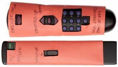
We are now firmly in the age of the Internet of Things (IoT). The objects in our lives are no longer isolated but are participants in an increasingly connected world.
Unfortunately, far too often IoT devices still behave as just that: things with some thin veneer of software tying them to the internet. If your thing is hard to use now, it’ll be worse when you put it on the internet.
Developers don’t recognize that in order for those things to be successful, that software must be usable by the human beings who want to control those things, in a very different way from what we have all been used to. So before you think about putting your thing on the internet, start thinking about how people use things in the first place.
That’s where it starts to go wrong in the development process. Engineers, who are admittedly hardware-centric, tend to minimize (or ignore) the importance of human usability in designing their things. They’re used to having cost and physical constraints dictate the user experience, and we’ve all learned to live with that. That’s why you have to get the user’s manual out of the glove compartment to change the time on the digital clock in your car.
Just adding a small screen to a device doesn’t always help either; if not done right, the usability of the software on the screen just adds another layer of complexity (“Oh, more pixels, I can add all this extra data nobody needs”). I have a printer with a cute LCD screen that I often want to throw out my office window because it’s such a pain to make it do even the simplest tasks.
On the other hand, there are plenty of examples of things that simply work. There are fire alarms that don’t just beep; they tell you, with a speaking voice, in the language of your choice, whether there is a fire or if it senses carbon monoxide. There are cars with a couple of buttons near the radio with a small clock on one button and an “H” and “M” on the others. Simple, but thoughtful: you don’t need the manual just to change the clock twice a year for daylight savings time.
We all admire Apple and their emphasis on the usability of their products and software, but even their most basic of things – headphones, power adapters, remote controls – are designed to be a joy to use.
What makes a thing usable on the IoT?
I hate to be obvious, but usable things have an emphasis on usability woven into the design process from the very beginning – emphasis that is deserved and long overdue – and then usability testing is conducted to make sure that design assumptions aren’t misleading you.
More obvious, common sense: It’s a lot cheaper (in terms of manpower and your company’s reputation) to fix a usability problem before you release your thing, than it is to have to deal with all the problems after it’s out in the market, including the complaints, lawsuits, and “don’t ever buy anything from these people” comments on Amazon and social media. Why even bother releasing a product to the market that hasn’t incorporated the human factor? Humans will notice. Humans don’t like spending money for something that turns out to be frustrating – and even impossible – to use.
Conversely, humans who buy your thing and find it easy to use will literally help you sell that thing out in the market. They will show it off; tell their friends; write or record glowing reviews that prospective buyers will read or watch; and, in some rare cases, line up outside your store for days when you are about to release a new thing. Usability is that important.
The art and science of IoT usability testing
There is an art and a science to proper usability testing. The science is pretty straightforward; you decide on a logical process, and you follow it. You do your preliminary research to find out what your buyers want. You work their preferences into your design process. You build a simple mockup that you take to those you interviewed and others, and you see how easy (or difficult) it is to use. You document your findings and make adjustments accordingly and repeat the process, until the thing just “works.”
The art part? During that process, you will be surprised; openness and humility play a major role in this process. If you love your little red button on the screen and no one understands what it does, you’ll have to fall out of love with that little red button. And of course, the input you get from potential users will have to be incorporated into the next design iteration. This is where your creativity comes in.
Before you start this whole process, there’s another “art” part – determining the intent of your user. What do they really want to achieve with your thing? This is critical because your thing should do what they want it to do, and only what they want it to do. Feature creep is the biggest enemy of usability.
Just because you could put that function in there, doesn’t mean you should. This is probably the most difficult aspect of usability design. Those of us who are technical are intrigued by all the things something can do. Users are only intrigued by the things they want that thing to do.
Adding these strategies to your thinking, and following a solid design process, will immediately put you miles ahead of competitors who are not taking these steps.

